4 to 6 Traditional or Online Editorial Information Pages
For my double page spreads i wanted the article content to be clearly shown throughout, this affected my design decisions as i wanted to make sure that my colour scheme clearly represented nature, because of this i used green, blue, brown, black and white throughout which immediately gives the reader an idea of the content that will be in the magazine. I also chose my imagery depending on each article, the image in my magazine is what catches the eye first so i felt as though it was important that the images related to the articles. For my grid structure i used a 4-grid structure across my double page spreads. This helped me balance out the content and keep everything organised and in line with each other which makes the spread look clean and professional.
For my first 2 pages of the magazine i used the first article which was about the Yorkshire Wolds. On these pages there is a clear hierarchy using headlines and pull quotes from the article this is to grab the reader’s attention and get them interested. I have used the space effectively using the grid structure i chose so that none of the content is crammed together and the readability is easy. The images immediately grabs the reader’s attention. The type i have used on the main body of text is Gotham this is easy to read. I have also added a drop cap to the first paragraph to show the reader where the paragraph starts and to catch their eye. The colour palette relates to the article and also to the brands identity.
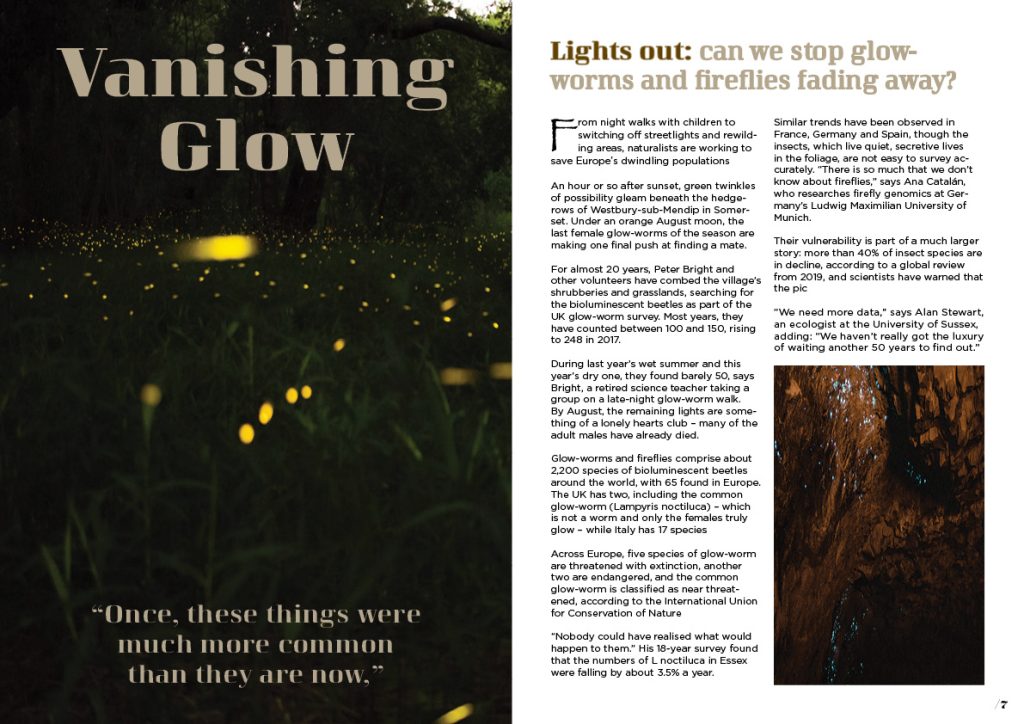
For this page i used a brown colour to represent the glow of the glow worms which represents clearly what this section is about. On the headline i used tracking to space out the letters to make it easy to read and stand out. On the subheading i used a darker colour to clearly emphasise the beginning of the quote from the article.
On my draft attempt of this page the text didnt flow nicely because of the allignment i chose, this caused rivers to happen in my text which looked messy and unorganised it also decreased the readability. As there is a lot of text on this page i used a drop cap to clearly show where the paragraph starts.
On this page i pulled the colour from the images so that they look nice together and also flow together on the page. For the pull quote on this page i aligned it to the edge of the page as it enhances the readability and makes it visually appealing.
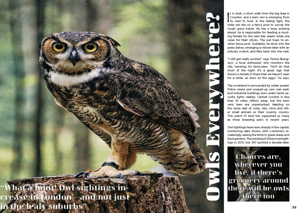
Using the third article for my last pages of the magazine i had to change a lot to make it flow nicely on the page, i used left alignedtext so that the text flowed smoothly. The headline is bold in the font curve which is sans serif easy to read and catches the reader’s eye. I chose to position it on the side so i could fit in the pull quotes nicely. The colour palette relates to the article but also to the rest of the magazine. The composition on this page has a good flow and is also easy to read. There is a good hierarchy which clearly shows the headline and subheadings apart. The tracking on the headline improves readability but also allows it to fit well on the grid structure which makes the page look more organised and professional.