Colour
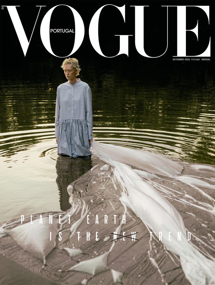
I think that this is a Strong Example of colour used in a Fashion Magazine because the colour very clearly represents what the magazine is about. The colours used in this straight away give the reader a feeling. The green colour on this represents a sense of nature, growth and freshness whereas the rest of the magazine is in neutral colours which makes the reader feel calm, stability and sophistication which also is what we think of when thinking of Vogue. The headline and sub-headings are in a bold white colour. A white colour usually can represent new beginnings which is what I think this magazine is trying to portray. The subheading “Planet earth is the new trend” being in white shows this as it means that being sustainable and thinking about the environment is a very normal thing in this society. The magazine creates a relaxed and welcoming atmosphere which would make the reader feel comfortable and engaged to read on which also gives a sense of ease. The magazine feels elegant because of the imagery, it is very minimal which helps the rest of the magazine flow nicely. The colours used aren’t to bold they all flow nicely together on the page which helps your eye focus on all the elements on the magazine. The colour of the text is very readable and interests the reader visually it also creates certain emotion and feelings with the colours used. The colour on this also shows the brand identity of Vogue, Vogue is an elegant, high end, professional and formal brand that everyone knows. They have made this clear in this magazine which then targets a specific audience with the colours used as it feels like a very premium brand with strong beliefs, which can be seen in this magazine as it is clear it is about the world\sustainability.
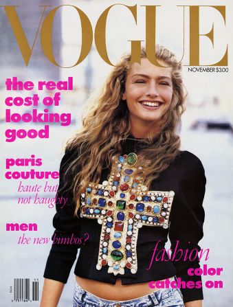
I have chosen this fashion magazine as an example of a weak use of colour. In my opinion when first looking at this magazine cover it is very confusing to look at which instantly draws the attention away from it, as it feels like a lot of effort to try and understand it. The colours used on the magazine don’t represent what the magazine is about or give us a clear message. The headline is in a brown colour which usually makes us feel like it is reliable it has a hint of gold in the colour which makes it feel sophisticated. However, they have then used a hot pink colour for the text which represents a fun, playful and youthful feeling to the magazine. These 2 colours represent a very different feeling which don’t belong together to portray a certain message. The use of these two colours dont appeal to one target audience. The magazine doesn’t draw your attention to one certain part of the magazine, it feels very random which disconnects the audience from the magazine. The colours clash which makes it feel very chaotic this overwhelms the reader. The magazine feels very unprofessional. This does not fit with the brand. Vogue is known to be very professional, sophisticated and minimal. This magazine cover is the opposite of this, Vogue is also known to portray a message and to want to inspire the audience, because of the random colours the magazine doesn’t do this which would confuse the usual vogue audience and draw their attention away from it. Another big reason why this has a weak use of colour is because of the colour used in the background it doesn’t contrast with the colour of the text or headline which makes it hard to read and focus on.
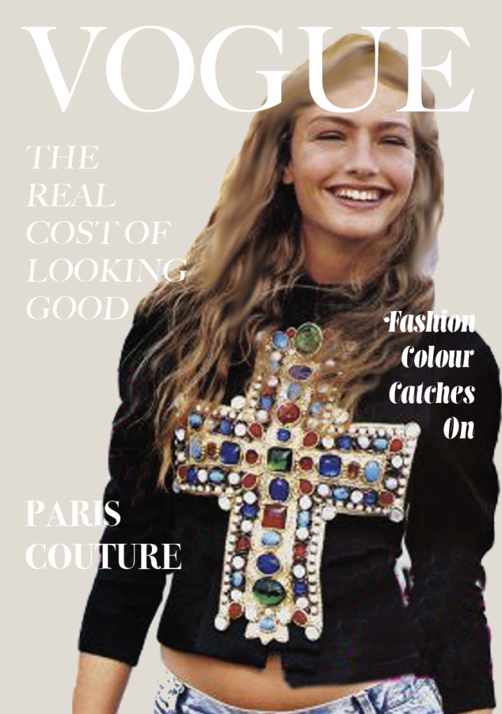
When redesigning this magazine cover so that the colour is more effective. I changed the background to be a solid neutral colour; I did the same with the text so that it fits more with the brand identity of Vogue. I used the colour from the cross on the jumper in the background to blend both the image and text together to create more balance.