Online or Traditional Conceptual Editorial Masthead (logo)
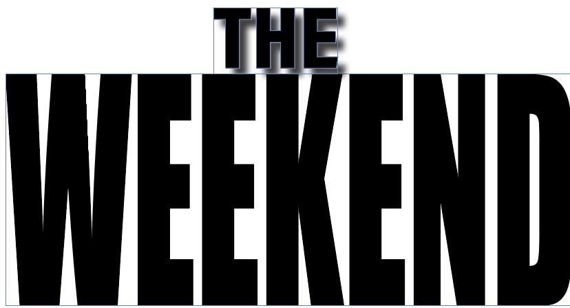
When creating my logo for the magazine my initial thoughts was that it needs to give the audience a feel for the brands identity and give them a good first impression of the brand. I wanted to make sure that the logo is simple but has a professional look to it, when designing it i made sure that it was relevant to the brands identity but was also memorable and versatile for a variation of people. It is easy to recognise and stands out on the page. For the typography i used Impact, this sans serif font is easy to read. It is also bold and stands out which means it grabs the reader’s attention and draws the eye immediately. Because of this i feel as though the logo doesn’t get lost on the page and stands out but also leaves room for other things when placed on the cover. I have only used minimalist colours on the logo as that makes it easy to read and increases the accessibility. I also feel like a minimal colour makes the logo stand out more when placed on a front cover with images or text. Before designing my own logo i wanted some inspiration which got from different websites however i particularly liked this one as it showed me lots of minimal yet professional designs. https://logosystem.co. When considering the composition for my logo i wanted it to have a good balance and hierarchy. I wanted the ‘weekend’ to stand out so i increased the size, this contributes to the effectiveness of how the logo represents the brand, attracts the reader and looks visually appealing.
For my first attempt at designing the logo i used the same font for the bold minimalist look i wanted from the beginning however ipositioned the words different and added a drop shadow effect on the background. When i added this to my front cover i realised ididn’t like it and that it didn’t fit with the brands identity which helped my decide on my final design which is a lot more basic however that is what i wanted so that it doesn’t take away from the cover but also doesn’t get lost on the page. I then moved the positioning of the logo and decreased the size of the type on the word ‘the’ so that the ‘weekend’ part stood out more. I feel as though changing this was the right decision for my logo as it flows better with the rest of my designs and the brand’s identity. I also originally wanted to use colour in the logo, to represent the nature theme i used a green colour for the logo, however i decided against this idea as when put on a front cover it was hard to get everything to flow on the design. This is then when i decided using minimalist colours was a lot simpler and meant that the logo could fit in nicely no matter how i decided to design the front covers.