Typographical/Branding Standards
When designing my double page spreads, it was important to create a brand kit. This helped me decide how i would want my magazine to be portrayed, or how i could ensure there was a consistent theme throughout. My brand kit helped create my brand’s identity, examples of this are the colour palette. I wanted a colour palette that clearly represented nature which i could then use in my designs. It also helped with image inspiration that i could then use to develop what images i wanted to be included in my magazine. The brand spectrum was very helpful with how i wanted my magazine to make the reader feel and to clearly show how the brand is portrayed.
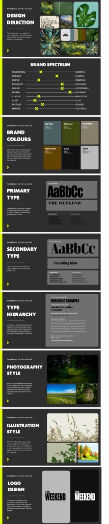
For the typography used in my magazine i wanted it to be clear and easy to read. I chose to use ‘Impact’ as my primary type, this was used in my logo. This is a sans serif font which is bold and condensed, this means it’s easy to read and grabs the reader’s attention immediately. I like how the font looks quite heavy making it bold, but it also looks very professional the way i have used it. For my secondary type i used ‘Curve’ which i made sure to use on all my sub-headings throughout to give my magazine a good flow. This is also a San-serif font which is easy to read but also looks very modern and elegant. I look how condensed the type is whilst being very easy to read and eye-catching. For any text i used from the article i used ‘Gotham’ as i feel it is a very simple type which is easy to read and understand so that it doesn’t feel like a lot of effort to have to read the magazine. I have made sure that my magazine has good accessibility by choosing fonts that are clear and including lots of images throughout which helps give the reader and idea of what the magazine is about. I have also used relevant contrasting colours that go well together and don’t decrease the legibility of my magazine. As for legibility in my magazine, i have used clear fonts, i have also kept the font sizes easy to read and made sure the spacing throughout makes it easier to read. Throughout this whole process of creating my magazine i have developed and refined the designs constantly. This involved changing type sizes to fit better on the page to increase the legibility. I also experimented with several fonts before finalising them to see which ones the easiest to read but also fit with the traditional, simple yet elegant feel i wanted throughout. I also had to make sure the colour palette i chose was relevant to the article and clearly showed the reader what the magazine was about. When apply my typesetting in InDesign i made sure that my text was visually appealing throughout and that there wasn’t any text that looked crammed together and placed randomly.