Typography
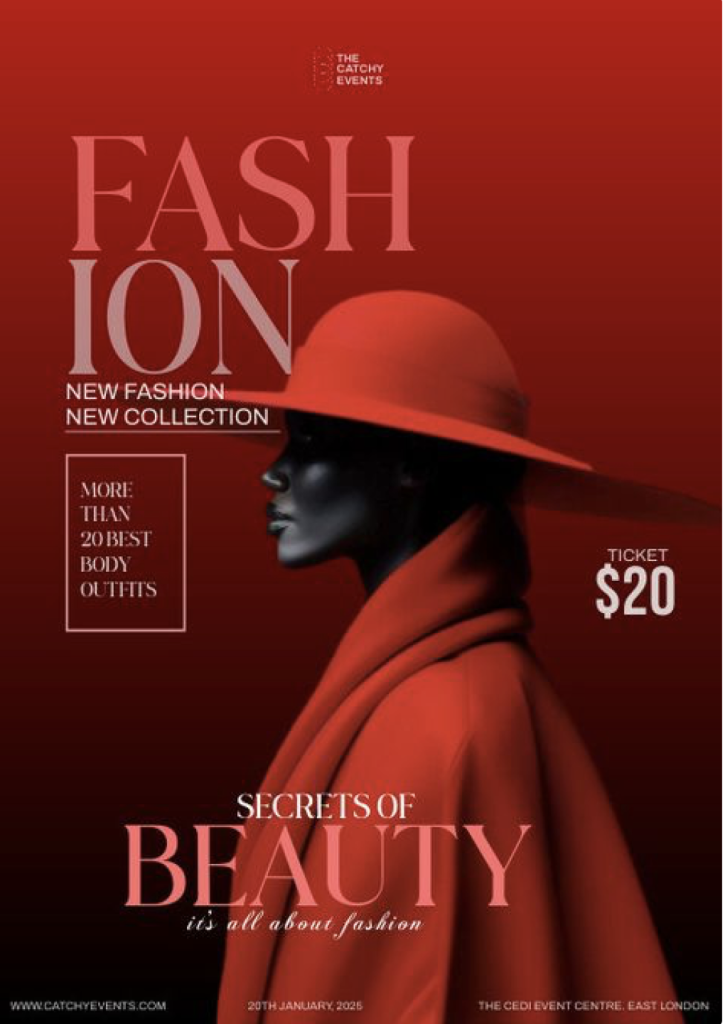
I think that this Fashion Magazine Cover has a strong use of typography. In my opinion this is because there is a good hierarchy on the text throughout, this gives a good balance to the cover throughout and helps the reader to know what to look at first on the cover. The colour of the type contrasts well with the background which makes sure that the text doesn’t get lost in the background making it harder to read. The ombre in the background also helps to make the text stand out because of the lighter colours on the dark background and the darker colours on the lighter part of the background. This makes the flow of the cover easier to read. I like how the type is position around the hat leaving a lot of negative space on the cover which helps the readability of the cover and gives it a lot more balance when reading it. The type that has been used is all in uppercase which usually i would be against however in this magazine cover it has been used effectively. The uppercase letters give a sense of class which feels quite delicate to the eye when reading it. This then targets a specific audience for the magazine cover. The positioning of the text is organised; this is another way the cover targets a specific audience. The organised and minimal look makes the cover look more visually appealing and makes it easier to read. The type is in a serif typeface which looks more formal and traditional, it’s also easier to read in bold typography like what is being used in this. The typography used here would show the audience that has never seen this brand before a first impression that it is a formal, classy and minimalistic brand.
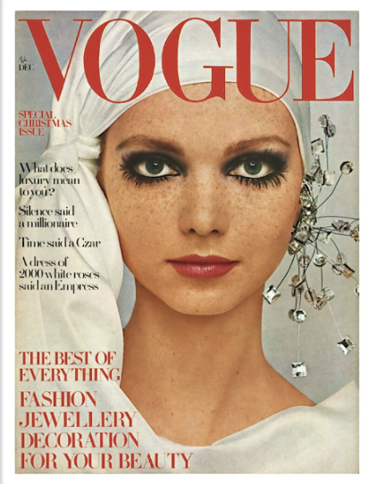
Here is my example for a weak use of typography on a fashion magazine cover. In my opinion the first thing you notice when looking at this magazine cover is the imagery; it very quickly draws the attention away from the typography making it hard to focus and read it. The colour of the typography throughout doesn’t contrast well with the image or the background. It’s hard to read and feels like a lot of effort for the reader to try and make sense of what is going on in the magazine. The uppercase typography feels shouty and aggressive which does not fit with vogues brand identity, when we think of vogue it feels very formal and classy which is not how we feel when reading this magazine cover, it feels very rushed and messy like everything has been placed on the design very randomly. The text is all on the left-hand side which makes the cover feel unbalanced and looks messy. This makes it hard to read but another factor why it is hard to read is because of the different colours used. There is a lot going on in the cover which makes it very confusing, the change between the uppercase and lowercase letters makes the audiences mood change constantly when trying to read the cover, this means it is not clear what we are meant to feel throughout and doesn’t clearly represent what the magazine cover is about. Therefore, the typography doesn’t have a good hierarchy throughout. The positioning of the text is very unorganised and feels rushed which makes the audience not want to carry on reading. Also, if this was someone’s first impression of Vogues brand identity, they would get the complete wrong idea of it and possibly put them off wanting to read more.
When redesigning my weak example for typography i have changed the colour of the text to make it flow better and easier to read. I have also changed the layout of the text from being all at one side so that the magazine cover feels more balanced. I changed the brightness and saturation of the image so that it blends more with the typography.
