Three Cover Designs
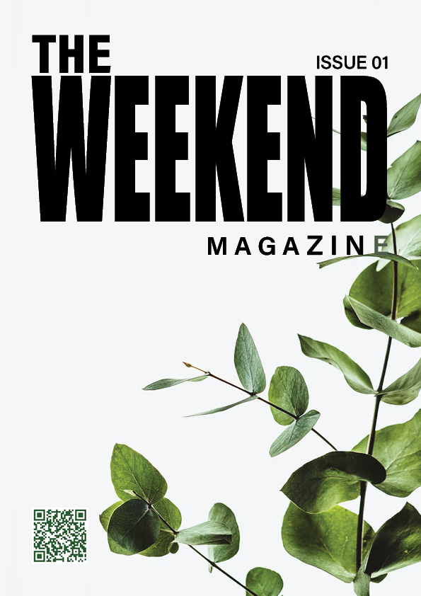
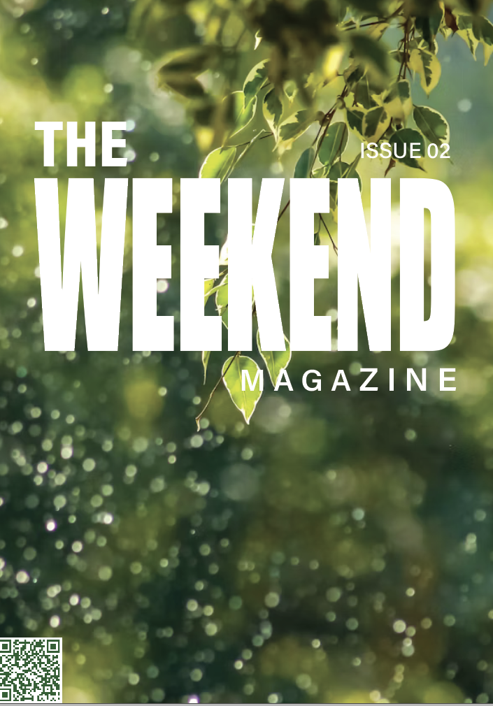
My conceptual thinking behind this design was that i wanted it to grab the reader’s attention straight away whilst also showing the brands identity. I have done a very minimal design; the layout is simple but also effective. It gives a subtle hint to what will be inside the cover. I have also used colours that flow together throughout the entire thing. The bold font immediately captures the attention of the reader; there is a clear hierarchy on the type. The image i have used is minimal as i didn’t want to have too much going on that could be seen as distracting and hard to look at. I used a two-grid structure for this design as i felt like it was the easiest way to look more organised and to make sure that all of the elements on the cover are lined up correctly.
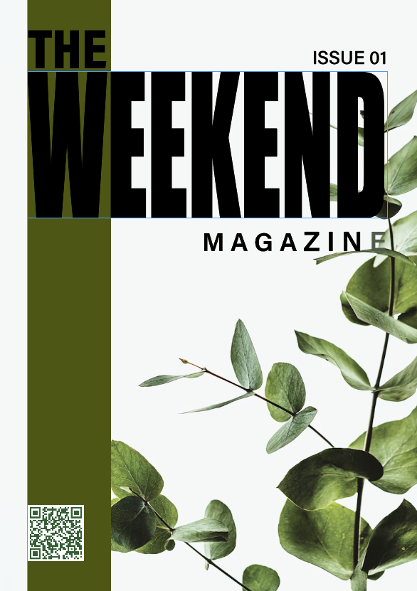
In the early stages of designing this cover i originally added a block colour shape down the side however i decided against it as i really wanted it to have a minimalist feel. I felt as though this looks quite cluttered.
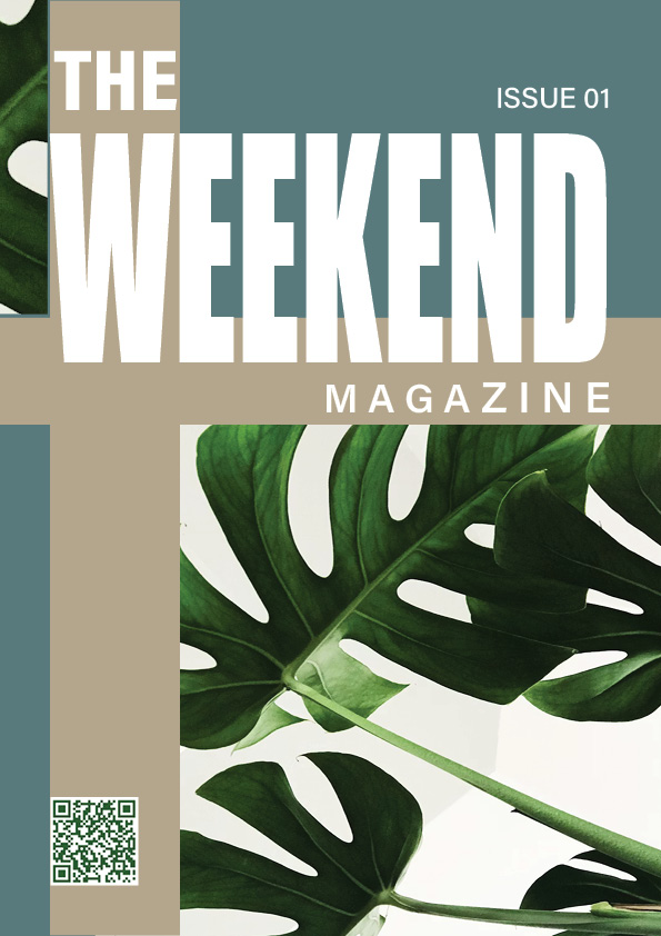
When designing this cover i wanted to incorporate the colour scheme i chose in my brand kit a lot more to tie it into the whole thing to make sure i was sticking to the ideas i originally chose. The khaki beige colour feels warm, natural and reliable which gives the reader a first impression of the brands identity, and reliable whereas the deep teal colour gives an outdoors feel and ties in the three articles included in the rest of my designs. For the typography it is bold and stands out, i felt as though the white colour worked better on this cover design as it blends in better. The imagery i have included is quite minimal as i didn’t want to have too much going on which could reduce the accessibility and readability.
When originally designing this cover i had added thickness to the outside of the beige shape with a green colour to tie in the colour of the imagery however i decided against this because i felt as though it made it hard to focus on one thing on the design.
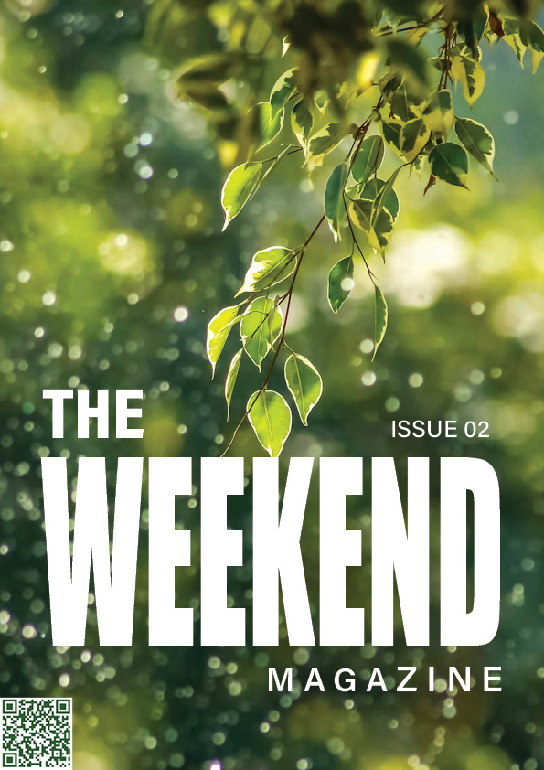
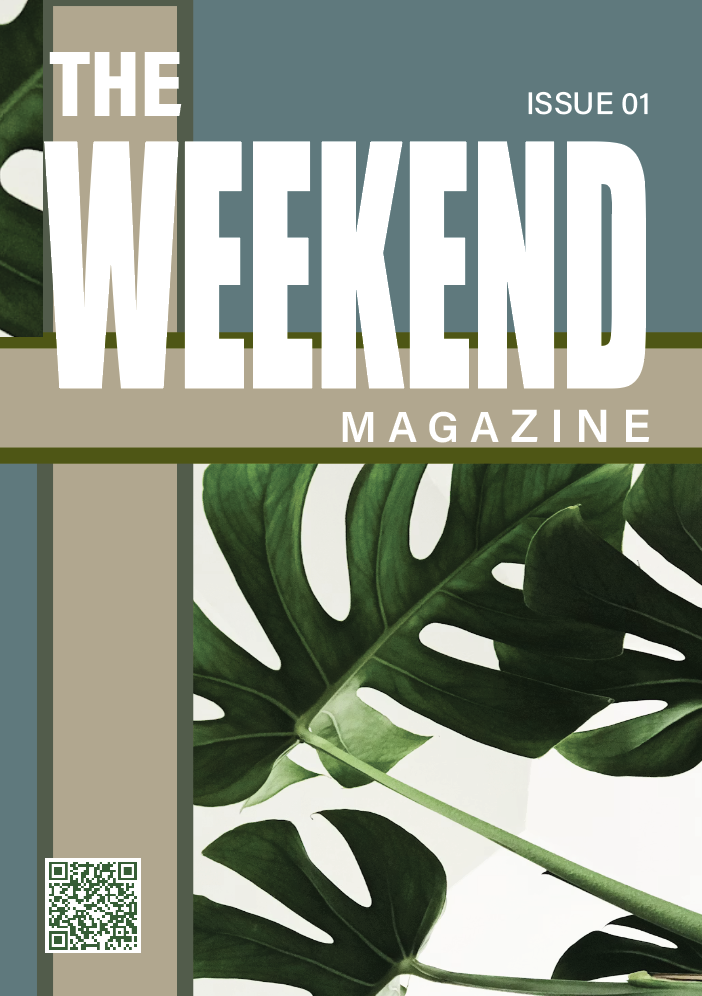
For my final design i kept the design quite simple as i wanted it to keep true to the brands identity, for the imagery i chose a bright, high-quality image. It has a blurred background with a clearer image of leaves which stand out as that immediatley draws attention to the cover. When positioning my typography i chose to place it on the bottom of the page so that it creates hierarchy on the design, this increases the readability and doesn’t feel hard to look at or distracting. This gives the design a good balance throughout. I made sure that my typography lined up with the two-grid structure as it makes the design look professional and clean.
The typography was originally placed higher up like the rest of the covers however i felt as though this meant the image in the background got lost. Which i didn’t want as i wanted it to be one of the main focal points.