Post 2: High-Fidelity Mobile App
The final Urban Art mobile app has been designed to give users a professional, intuitive experience whilst feeling a strong atmosphere of the world of fine art. My high-fidelity prototype provides a premium experience with a clean digital experience.
The landing page introduces the user to the brand instantly with the primary logo, instantly making the brand memorable.
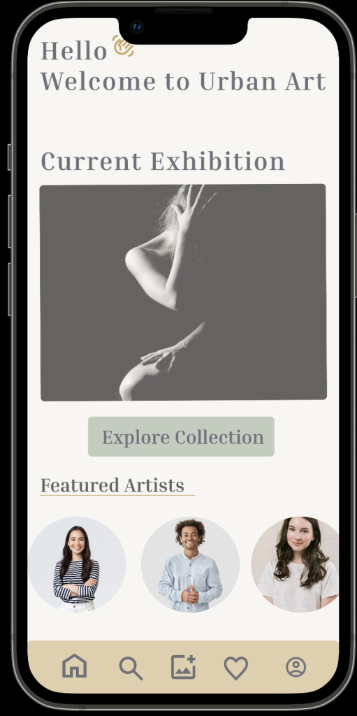
The home page introduces the user to a current exhibition again with a neutral colour palette so that the artwork is the main focal point. The typography is clear and easy to read and has a strong hierarchy helping the user know what to read first.
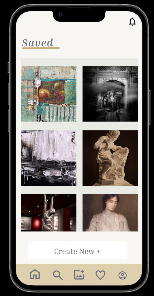
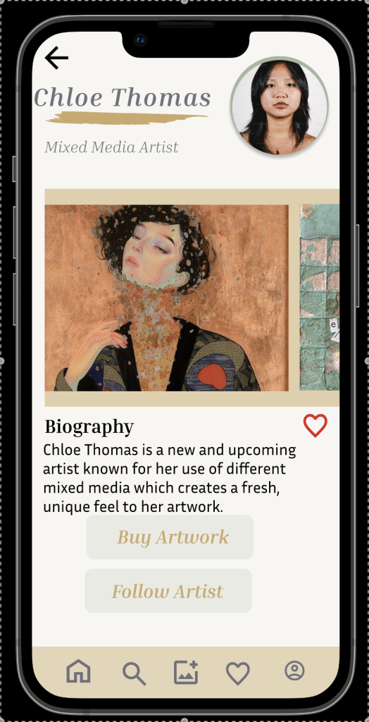
Users can browse collections, the layout is in a grid system which makes it easy to explore the artwork, there is also a feature to find out more by clicking the image which takes users to artist biography, buy artwork and follow the artist. These features will help the user to feel more familiar with artists.
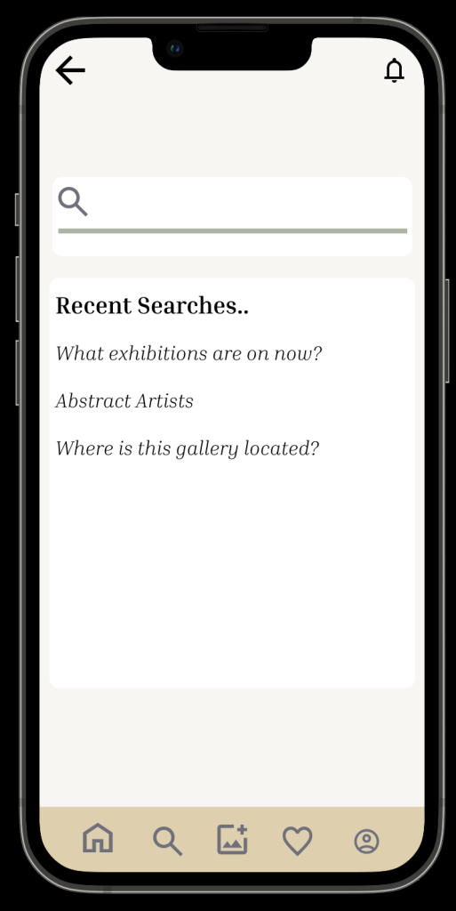
The search page allows users to access more information. I added a physical search bar feature that allows the app to feel more accessible and easier to navigate.
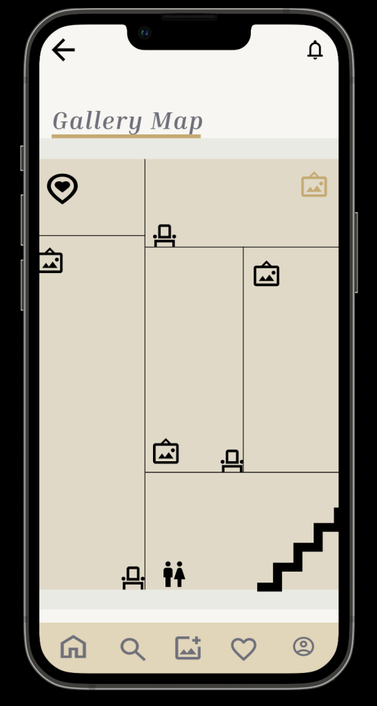
When creating my interactive map i added each room with overlays to help the user feel more familiar with the gallery.
Throughout the app i have used soft neutral tones that creates a professional experience that complements the artwork without distracting the user. For typography iused a sans serif font that is easy to read for anybody text and a serif font for headings that feel more modern.
The navigation bar allows users to navigate through key parts of the app with minimal effort which will be good for people that don’t want to go through lots of interactions to find what they are looking for. The buttons remain consistent throughout to make the app familiar and increase usability.