Post 3: Design Reflection
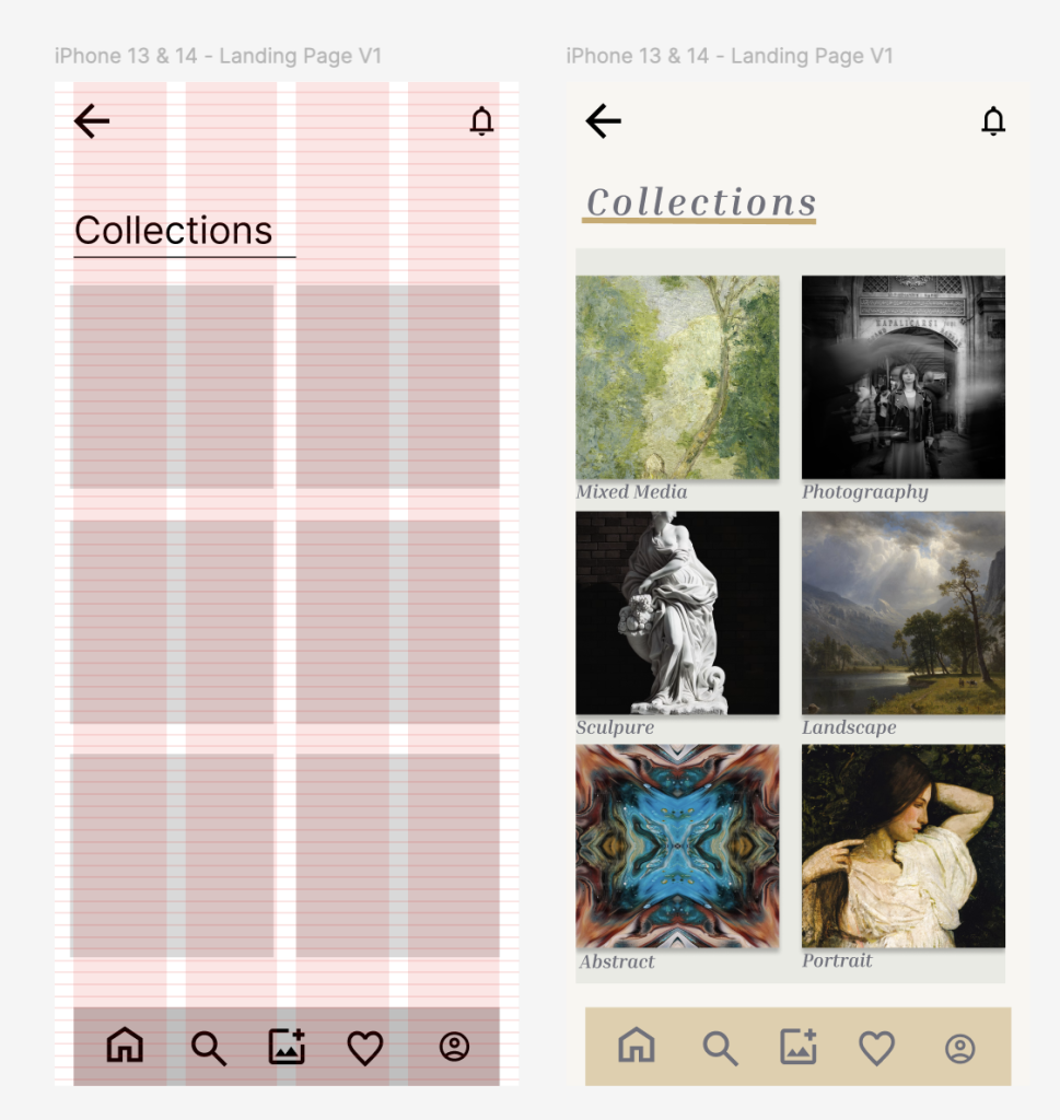
During the design process of my app i made many assumptions about what users would want from a fine art gallery. I assumed users would want a simple, professional and intuitive app. Because of this assumption i designed an app that is a clean, minimal design with clear navigation and consistent layouts throughout.
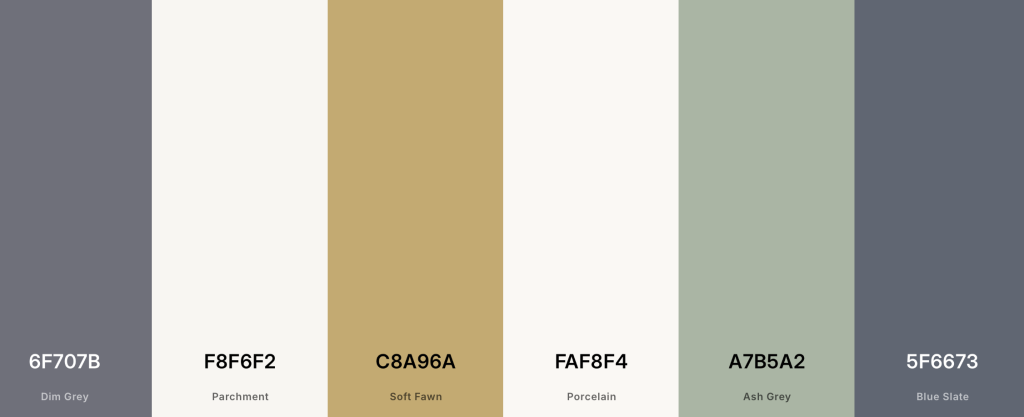
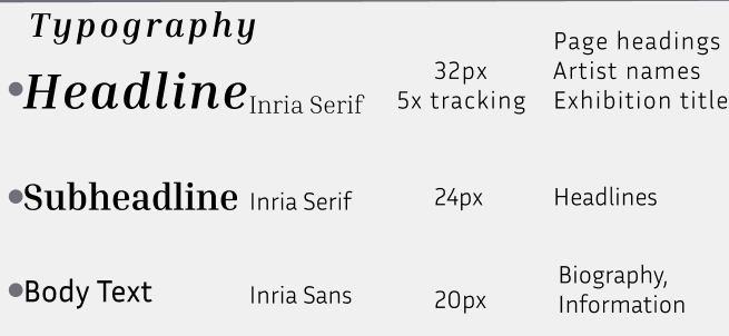
My aim for this app was to create a digital experience for users that feels like they’ve stepped into the world of fine art giving them the atmosphere of what fine art feels like. The typography i picked was for a clear visual hierarchy, which shows headings that stand out and body text that is easy to read and understand. I chose a warm, minimal colour theme dim grey, porcelain, soft fawn, ash grey and parchment that looks sophisticated and clean but also stands out and keeps the attention on the artwork. Reusable UI components including buttons, artwork and navigation icons were used throughout to ensure consistency on each page and easy usability.
Colour Scheme
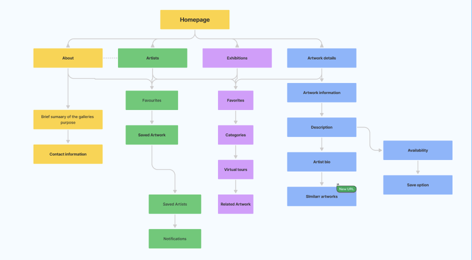
User Flow
Typography
Buttons
For my app to be successful users will be able to navigate confidentially and complete key parts of the app with minimal effort. These things will be exploring exhibitions, viewing artworks, learn about artists and access information about the gallery. The app should feel welcoming, warm and engaging for a wide audience whether they are familiar with fine art or just discovering it.
My design decisions were made from research into different art galleries and mobile apps with minimal layouts, generous white space with high-quality imagery of artwork that fully showcases the art. I developed my ideas with crazy 8 sketching, low-fi prototypes and high-fi prototypes, this allowed me to develop a consistent layout, effective user flows which reflects my brand’s identity to the different users making the experience memorable.
Crazy 8 Sketching

Low and high-fidelity prototypes