Post 1: Design Style Guide
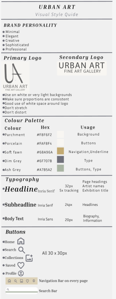
I have designed a visual style guide for Urban art fine art gallery. I have designed this in a professional format with colours that are easy to read and understand and all of the information that is important in the consistency of the app. This ensures that another designer would be able to apply the same visual style across several different platforms when designing the app.
There are many different aspects that a designer will need to be able to design the gallery app on different platforms such as the brand personality, which is minimal, elegant, creative, sophisticated and professional. It is key that this is included on different platforms so that the brand remains consistent and memorable. I then included the primary and secondary logo as i would want the brand to be known by the same logo which is recognisable. It is important that the logo isn’t stretched or distorted, has a good use of white space around it and placed on light backgrounds. The colour scheme is important to be consistent as it is a key part to the consistency of the brand, to ensure this stays the same i added name of the colours and the HEX so that the colours will be the same. Also ensuring i made comments on what colours are used for each component of the app. For typography it is important to keep that the same as i want the visual hierarchy to be obvious to the audience as it increases readability and highlights key information such as inria serif as the heading text as this is a bold, clean and minimal type that is easy to read. The final thing i have included on my visual style guide is any buttons or graphical elements that need to stay consistent across different platforms.
Visual Style Guide