Post 1: Design Elements
The Urban art primary logo is minimal and sophisticated which visually represents a modern fine art gallery. I wanted to make sure the logo is memorable to different users whilst also being simplistic. I used a dim grey colour that is easy to look at. I add a brush stroke feature through the “A” which adds to its being an art gallery brand. My secondary logo is a simple version of the primary logo which can be used on smaller screens also keeping the brand recognisable.
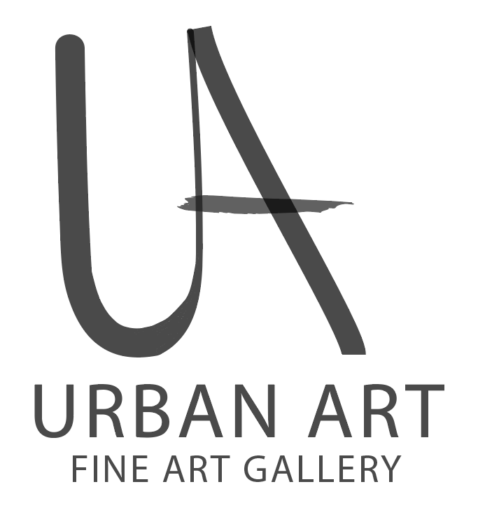
Primary Logo
Secondary Logo
For Typography i have made sure that there is good hierarchy throughout. I chose “inria serif” as the Heading font as it is minimal and bold which immediately draws attention to the important information. I used a clean sans serif font “inria sans’ for the body text as it is easy to read but also looks minimal and modern which keeps the gallery’s aesthetic.
For my colour palette i wanted colours that stand out on the page whilst also keeping the brands aesthetic clean, sophisticated and minimal. For the background of the app i chose a parchment colour which is an off white that looks minimal and doesn’t distract the user from anything on the screen, dim grey for the body text as it is easy to read. I also wanted to use a soft fawn and ash grey colour to add a pop of colour that isn’t too much.
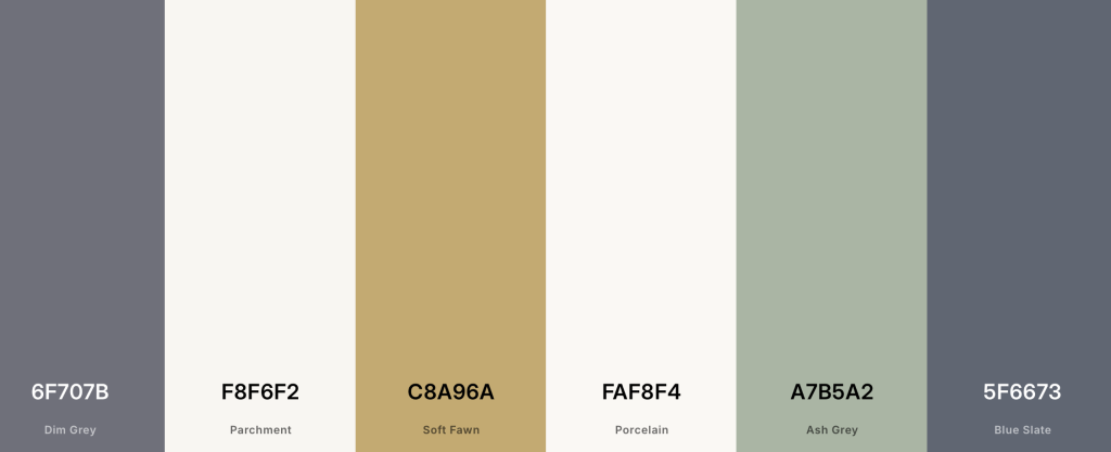
Colour Palette
For some decorative elements i will add thin line dividers, white space, minimal icons and rounded images these have all been kept subtle so that they aren’t distracting from the artwork. Buttons, search bar, navigation elements are all components that show consistency throughout and make the app easy to use.
Overall, these design elements create a creative, professional and accessible app. All these elements will help when it comes to designing my wireframes.