Composition
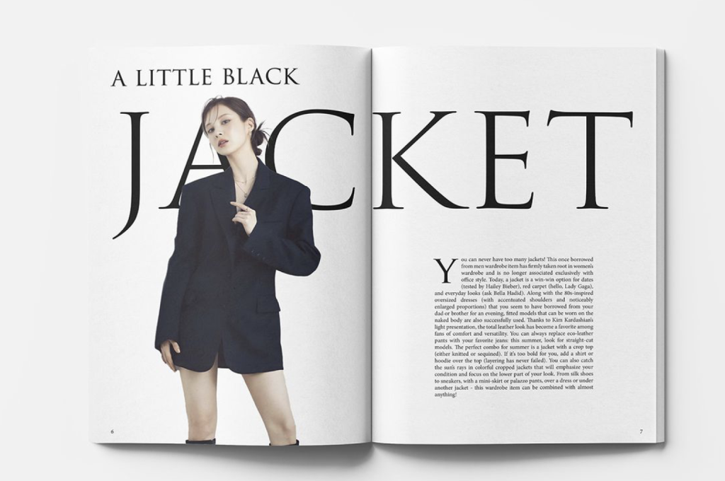
In my opinion I think that this Fashion double page spread has a good use of composition because it is very minimalistic. This really helps the reader to focus in on what the spread is about, the minimalism in this could also refer to how the jacket is worn and that they’re really trying to get across that the jacket is a simple item of clothing. Everything flows together well on the page which increases the readability, it also means that nothing is too distracting on there and there’s no confusion on what to read first or what is going on throughout. The typeface looks very formal which is effective because it looks clean and makes it easier to read. It is also a serif typeface, which adds onto the formal look which gives a sophisticated, professional feel to the spread. They have made sure to use simple colours, which in this case is just black to tie in with the black jacket which again clearly identifies to us what the designer is talking about. The spread has a simple layout which is very organised. All these things will attract a type of audience looking for these things in designs. The negative space on this double paged spread is very effective as it breaks up the design which also draws attention to key parts of the design. Having a lot of negative space in some cases can be a bad thing however, on this design it has worked very well in my opinion as it has made the design look more visually appealing. The imagery that has been used is very simple but very effective, it draws the reader’s attention to it straight away however it doesn’t distract you from the rest of the pages making the design easy to understand.
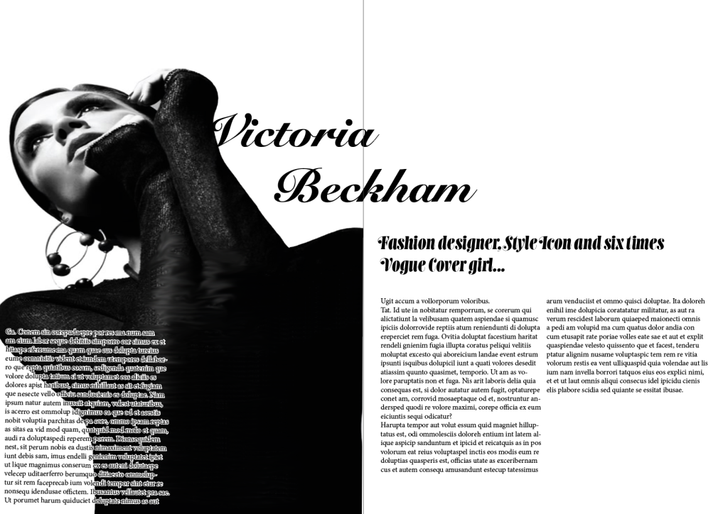
In my opinion this fashion double page spread is an example of a weak use of composition. In my opinion the legibility is a big impact on why this is a bad example. On the right-hand side it is very hard to read because of the dark image in the background. There is too much text crammed into that part of the design and the text isn’t bold enough or clear enough to read. This will also frustrate the reader as it’s not easy to tell what is going on. Because of this you start to try read the spread from the right-hand side which is not how the text is laid out, the first thing that draws your eye is the bold image. I feel as though the image on the spread makes it hard to focus on anything else in the design which looks random on the page as the rest is very minimalistic. There isn’t a nice flow throughout the spread, the headline has been designed with a random typeface that doesn’t fit with the design and when trying to read it doesn’t feel like your eye easily reads through the page, it feels like you don’t know where to look first. The font is hard to read and doesn’t match the theme of the spread. When i think of Victoria Beckham i think of a classy quite formal woman and i don’t feel like this has been put into perspective when creating this double page spread The level of text is unbalanced and very random, there is a lot of negative space in this spread that could of been used, sometimes this can be a good thing however i feel like using the space for this specific spread could make it look more professional and thought about.
I have now redesigned the double page spread with a weak use of composition. I did this by placing the image on the left side and making the text stand out more on the dark image to make it easier to read. I also changed the headline and used a different serif font that is easier to read and is clear to the reader what the spread is going to be about straight away. I also added a subheading in a bold serif font so that when the reader first looks at the spread it is a hint of what they are about to read.