Conceptual Design
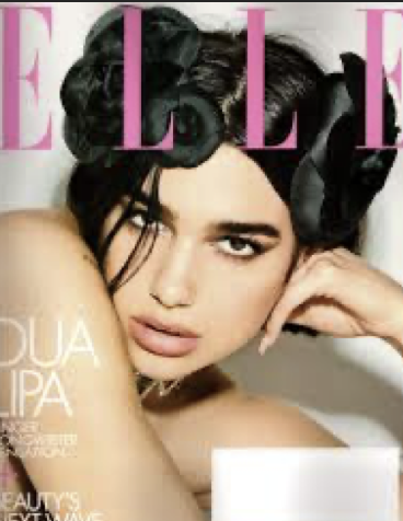
I have chosen this Fashion Magazine cover as a Strong use of conceptual design. The Masthead on the cover is bold which instantly grabs our attention and makes the reader want to read on to find out more about what the magazine will be about. The Masthead being very bold is good thing because it stands out from the rest of the text on the cover which makes it obvious where the Masthead and the text differentiate and they don’t blend making it hard to interpret. The tracking on the Masthead is very spaced out. This is good because it makes the readability easier and more visually appealing, however it also makes the Masthead look more elegant and modern which would then target a specific audience looking for these things. The Masthead has a good use of colour. The pink colour feels fun, exciting and youthful which would then attract this type of audience to be enticed to read it. The colour of the Masthead is different to the rest of the text which helps it stand out from the rest and grab the reader’s attention immediately, following on from this the hierarchy of the Masthead and the text has been done effectively because the Masthead is a larger typeface then the text. Straight away looking at the Masthead, you can tell what type of magazine you are about to read which is a good thing because it will instantly attract the right audience as you don’t need to read into it to figure it out. This helps to keep the reader’s attention. The Masthead is in a Serif font which makes the magazine look more stylised. It also gives off a traditional and formal look to the magazine. In this magazine cover they have used a serif font on the Masthead but not on the text underneath this is so that there is a clear difference between the two which again shows the hierarchy.
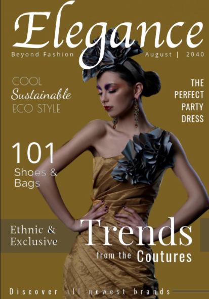
I think this is a weak example of conceptual design used on a fashion magazine cover. I think this because the Masthead doesn’t reflect what the magazine is about. This is clear because the Masthead says ‘Elegance’ however the typeface does not feel elegant at all. It is in a San serif font which feels very minimal, clean and boring. I don’t feel as though this represents the magazine in a good way as it doesn’t fit with the rest of the magazine. The Masthead blends in with the rest of the text on the cover. There is no hierarchy on the cover, it is not clear what the reader is meant to focus on first which makes the magazine cover hard to read and leads the reader’s attention away from the cover. The imagery that has been used is the first thing that you notice when you look at it, it feels very bold and like it’s been placed very randomly. The image has also been placed over the Masthead which i feel as though draws the attention away from it and doesn’t make the masthead stand out. The Masthead is in capital letters which feels very shouty, aggressive and makes it harder to read. This then doesn’t represent what the magazine cover is about and doesn’t feel elegant at all. The typography used on the masthead is very thin, the letters aren’t bold which makes the Masthead get lost on the page when it should stand out from the rest to make it clear to the audience what they are reading. The Mastheads tracking is very close together which feels crammed together and makes it harder to read. This also makes the whole magazine cover look less visually appealing to the eye and doesn’t grab the reader’s attention.
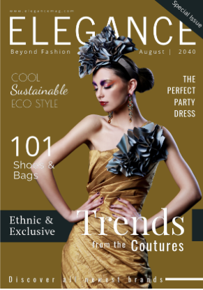
When redesigning for conceptual design i made the masthead bolder so that it would stand out from the rest of the text and was clear to the reader. I also used a type that is more elegant so that when looking at the masthead it instantly represents the magazine and gives off the feeling that is right for the magazine. I also changed the lettering from all uppercase so that it didn’t feel as aggressive when reading it. Finally, I used a serif font for the Masthead to make it more traditional and formal.